Showing posts with label illustration. Show all posts

Wednesday, 6 November 2013

Meet the printmaker: Lucy Davey


We catch up with illustrator and silkscreen printmaker Lucy Davey, who's back for Volume 4 of The Print Shop.

Please can you introduce yourself and tell us a little about your work…What sort of prints do you make?


I'm Lucy, I make screen prints and I work as a freelance illustrator.

Are you solely a printmaker or do you work in any other creative fields?

Most of my work is commissioned illustration, mainly book covers and images for magazines. Its nice to do some printing occasionally and focus on my personal work


What is your earliest recollection of making a print and what made you to want to do more?

When I was a teenager I started making my own stamps from the polystyrene packaging that comes with pizzas! It works surprisingly well.  At college I got into monoprinting – I would layer paper over rolled out ink and draw on it. Then I started screen printing a bit at university.

What inspires you and are there any themes or ideas that often run through your work?

I think landscape and nature are my main inspiration.  It's usually filtered through something else though; a film, book or a photograph will spark off an idea.  I love early photos of American landscapes, places I've never been. My prints are of imagined landscapes really.


Could you give us an insight into where you work – your studio/workspace and where you print?

I've been in the Drawn in Bristol studio since March.  It's great having the printing facilities here as well.  Before that I was at Snap studio and I've done a bit of printing at the excellent Spike print studio.


Which other printmakers' work do you admire?

I've got a couple of Jonny Hannah's screen prints up on my wall at home. I also love Japanese woodcut, especially Hide Kawanishi and Saito Kiyoshi. Edward Bawden is a big inspiration too.

Printmaking is made up of lots of different processes, which aspect do you enjoy the most?

I like it when you do your first pull and it actually works!


Can you share a little printing trick or secret with us?

Its not really a secret, but keep your old cardboard rolls that parcel tape comes on.  They make excellent squeegee stands.


How would you like to develop your printmaking skills in the future?

I'd quite like to re-visit lino cut at some point. And there's a lot more to learn about screen printing!


Which printed publication do you most look forward to thumbing through?

Nobrow.

Monochrome or multi-coloured?

I like colour, but no more than three please.

Thank you, Lucy!  We love your bold, graphic prints and will certainly be using your squeegee tip.

Lucy Davey returns to The Print Shop for Volume 4, which is open from now until Christmas.  Come and snap up one of her vibrant prints or handprinted Christmas decorations while stocks last!

The Print Shop
Unit 6
Quakers Friars
Cabot Circus
Bristol
BS1 3BU

Open Daily
Mon - Sat 10am - 6pm
Sun 11am - 5pm

Tuesday, 22 October 2013

Guest Printmaker: John Kilburn

Currently, on our featured Guest Artist wall, we have a selection of wonderfully imaginative prints by John Kilburn. Originally from Bristol, John grew up in Devon, then moved to Bath where he studied graphic design and illustration at Bath Spa University. He is now a freelance artist, illustrator and designer based in Falmouth, Cornwall, having recently completed an MA in authorial illustration at Falmouth University. He loves making illustrated books, drawing and silkscreen printing, with inspirations from natural history and the absurd. 

We caught up with him to find out a bit more about his beautiful and sought after print-work.

My earliest memories of printmaking are probably similar to most peoples – potatoes and bubbles! Since then I have tried most forms of printing but it is only in the last 3 years that I have begun to use silkscreen as an integral process for my work. I did a short screen-printing workshop in Bath before I moved to Cornwall to start my MA.

During my masters I concentrated on three things - research, drawing and printmaking. I began to research into humour and the absurd; why do we find things funny? My first project was a visual response to trashy movies including vintage grind-house and B-movies as well as modern black comedies. I was intrigued by the intentional use of violence and obscenity for humorous purposes.

I tried to find processes and effects in screen-printing which were analogous to the qualities of cheap, trashy movies, using very cheap paper such as sugar paper and newsprint which would bleed, wrinkle and tear.  I also used low-res images for making the acetates and would intentionally misregister the layers. I began making screen-prints from original pencil drawings which naturally lose a lot of fine detail during the printing process. Being a complete amateur at this stage I was effectively trying to print badly whilst making a lot of unintentional mistakes at the same time!

Metamorphosis. 2 colour screen print in an edition of 120.
Around this time I was asked to make the poster for Falmouth University’s prestigious illustration forum. The theme was metamorphosis which happens to be a common theme in a lot of trashy cinema. My design was inspired by vintage film posters. This was the first time I had attempted a large print run and many more mistakes were made.

Cock ‘n’ Bull yellow. 5 colour print, edition of 30.
The following year I was asked to make the posters for the 10th anniversary forum The Absurd Event. I made two designs based on metaphor and the absurd. The absurd bird was printed in three colours as an edition of 80. Cock ‘n’ Bull was printed in five colours in a yellow edition of 30 and a blue edition of 10.

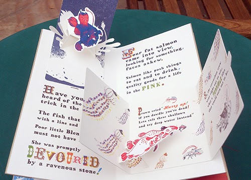
The Golden Plaice was the final project for my masters. It is a handmade pop-up book about an adventurous prawn inspired by nonsense literature and Cornish sealife. The first version I made was illustrated purely with pencil drawings but I gradually began to replace elements with printed imagery.

The Golden Plaice.  Original pencil drawings.

The Golden Plaice.  Red layer.I digitally split each drawing into 3 colour layers (red, blue and black), deleting some parts and filling other areas with black or a halftone pattern.
The Golden Plaice. Page 0. Silkscreen print. 3 colours, not editioned.
The Golden Plaice. Page 0 – Final version.  The final version that I used for the book is made from several versions of the same print – because I was printing the book with an inkjet printer I could change some elements digitally, picking the best characters and type.
As I worked through the pages I began to get to grips with layering colours to create new colours. My bird design inspired by classic tattoos was an exercise in creating new colours from 3 primary layers – yellow, red and blue. I began to apply these working methods to the screen prints for my book.

Birds. 3 colour silkscreen print, edition of 7. This print was an experiment in using layering halftones to create new colours.
The Golden Plaice. 3 colour silkscreen print. Set of four prints.
The Golden Plaice. How I used the screen print in the book.
I printed some of the type for the book, I found by intentionally misregistering some of the typography I could create some interesting effects. To make the book, my screen prints needed to be scanned, resized and printed as high quality inkjet prints. These inkjet prints are then cut out and the book can be assembled. The cover is printed using a technique called gold foil blocking. It takes me about two weeks to print, cut out and assemble each book. Each book is a new edition of one and so far I have made five with another four currently on order.


I am showing the first edition at The Print Shop, with the fifth edition currently being shown in Sheffield as part of the international book prize exhibition.

Forum 2013. Collaboration with Alys Jones. 3 colour silkscreen print, edition of 60.
Forum 2013 no.2 . Collaboration with Alys Jones. 3 colour silkscreen print, edition of 60. The red layer is blurry because the exposure unit had a dodgy vacuum.
This year I was invited back by Falmouth University to work with illustrator Alys Jones on the 2013 Illustration forum poster. I took her beautiful black and white designs and turned them into three colour screen prints (see above images). I was using a very old exposure unit and one of the colour layers became blurry and a lot of detail was lost but it is mistakes like these that I savour now, they are part and parcel with the joy of printing.

Printing new prints for The Print Shop

John Kilburn has created some new prints shown for the first time in The Print Shop. The first features images intended for a new book I am making Hummingbirds – a tragic love affair between a pyromaniac temptress and a romantic madman inspired by a series of terrible analogies. 

(detail)

The next print is based on some paintings of crabs that he made for his last exhibition. John has always been fascinated by sea life and happens to only live two minutes from the beach. 


We're honoured to have John sell his work through our shop for the rest of this Volume (finishing on 3rd Nov).  Don't miss out on seeing this bright new talent and looking through the pop-up book he has supplied us with too.


The Print Shop
Unit 6
Quakers Friars
Cabot Circus
Bristol
BS1 3BU
Open Daily
Mon - Sat 10am - 6pm
Sun 11am - 5pm

Monday, 21 October 2013

Meet the printmaker: Dawn Cooper


Please can you introduce yourself and tell us a little about your work? What sort of prints do you make?

My name's Dawn Cooper, and I work as a freelance illustrator in the beautiful city of Bristol. I produce screen prints of my illustration work, and get a lot of enjoyment out of making screen-printed products. So far I've experimented with making letter writing sets, placemats, notebooks, gift-tags and postcards, but I'd like to explore textiles and stationery a little further!


Are you solely a printmaker, or do you work in any other creative fields?

I'm primarily an illustrator.  I draw everything by hand in my sketchbook, and assemble my drawings on screen to make multi-layered illustrations with lots of digital colour and texture.  I like to dabble in screen printing (which is becoming a far more frequent exercise since joining The Print Shop!), and it can be quite a challenge translating my work into a limited colour screen-print.  I also love typography and packaging design, which I like to apply to my screen printed products.


What is your earliest recollection of making a print and what made you to want to do more?

I suppose I started screen-printing at university, and I was thrilled to be able to walk away with a finished product after a hard day's work learning lots of new processes.

What inspires you? Are there any themes or ideas that often run through your work?

My work is quite heavily inspired by natural history and botanical illustrations, and the natural world.  I am also a lover of quotes, and telling stories through a singular image.  I always find a good brisk walk brings lots of ideas to the fore, and couldn't recommend it more!

'Be Yourself' by Dawn Cooper


Could you give us an insight into where you work; your studio/workspace and where you print?

I work with the other very talented folk at the Drawn in Bristol studio, in Hamilton House, Stokes Croft.  I love the open-plan nature of the space, as I hate to be without conversation when I'm working.  I also enjoy the screen-printing facilities there, and the fact that there's always friendly and open advice on hand if you get in a jam!

Screen-printing in Hamilton House

Which other printmakers' work do you admire?

I absolutely love the work of Karolin Schnoor, a German illustrator, designer and screen-printer, currently based in London.  There's something very smart, beautiful and seemingly effortless about her image-making and bold colour combinations.  I recently bought some beautiful letterpressed notebooks of Karolin's, but I can't bare to use them!


Letter-pressed notebooks by Karolin Schnoor


Printmaking is made up of lots of different processes. Which aspect of printmaking do you enjoy the most?

I just love it when it goes well!  That, and seeing all of the layers come together, one by one.

Do you have a favourite tool or something you find invaluable when printing?

I think it's invaluable to remain calm and collected when printing, and have recently made a concerted effort not to get flustered during the process!  I think a tidy work space is a good way of achieving this, but I'm still working on that.


How would you like to develop your printmaking skills in the future?

I'd like to continue exploring new hand-printed products and gifts, and learn how to utilise and overlay single colour layers to create additional colours and tones.


Which printed publication do you most look forward to thumbing through?

The Here Gallery in Stokes Croft always has an amazing range of design magazines and independent publications.  A good friend of mine bought me a subscription to Oh Comely magazine, which is always a fascinating read, and although I'm not a cyclist, I enjoy the illustrated content of Bristol's Boneshaker magazine.


And finally; monochrome or multi-coloured?

I am a colour addict, unquestionably.


Thank you for sharing your working process and inspirations, Dawn!

Dawn will be at The Print Shop for the rest of Volume 3 with all of the above work for sale (while stocks last!). 


The Print Shop
Unit 6
Quakers Friars
Cabot Circus
Bristol
BS1 3BU

Open Daily
Mon - Sat 10am - 6pm
Sun 11am - 5pm

Saturday, 28 September 2013

Meet the Printmaker - Charlotte Farmer


Charlotte Farmer screen printing at Spike Island Print Studios
Please can you introduce yourself and tell us a little about your work…What sort of prints do you make? 
I'm Charlotte Farmer – Illustrator & screenprinter with a love of gold and fluroescent.

What is your earliest recollection of making a print and what made you to want to do more?
My first print was made while I was doing an art foundation course. The print department was on the top floor of the foundation building, it smelt great and was where all the cool kids in their Black Flag T-shirts seemed to be. Once I peeled back the paper on my first print (a linocut of a chair) there was no going back – I went on to a fine art degree specializing in printmaking where I got hooked on screen printing...

What inspires you and are there any themes or ideas that often run through your work? 
I love drawing grumpy looking animals and my cat Margo makes regular appearances. But I have branched out into more exotic creatures in my recent work. I like to imagine what thoughts or conversations all the aniamls (or whatever else I've been drawing) might be having. I think titles are really important as they can influence how people see your work.


Could you give us an insight into where you work – your studio/workspace and where you print? 
I print at the very fabulous Spike Print Studio, an amazing space with interesting people to talk to which is good because the rest of my time is spent home alone drawing.

The work of which other printmaker/s do you admire? 
I've always been a big fan of Robert Rauschenberg's screenprints and David Hockney's Rake's Progress etchings. Closer to home I like Luice Sheridan, Jane Ormes and Anna Marrow's work – Anna and I both went through the rigors of a St Martins MA (they tried to stop us printing!)
They all draw brilliantly, use great colour combinations and there is always an element of humour or something that makes you wonder what is going on.

Printmaking is made up of lots of different processes, which aspect do you enjoy the most?
The way the last colour makes all the other, seemingly random blobs of colour make sense...that's if it's all worked out ok.

Bananas
Can you share a little printing trick or secret with us ? 
It doesn't fit in with the image of an artist but you have to be ridiculously organised when you're screen printing, if you're not it can easily all go horribly wrong.

How would you like to develop your printmaking skills in the future? 
I like embossing – and always mean to do more.

Which printed publication do you most look forward to thumbing through? 
Wrap magazine

Monochrome or multi-coloured? 
Both and gold and fluroescent.


Thanks Charlotte. We love the playfulness of you work and the assortment of colours that you use so well together.

Charlotte Farmer's work is currently featured in the second volume of The Print Shop, which finishes this Sunday, but don't worry, she'll also be in Volume 3 too! So get yourself down there to see the selection of work she has on display, including greetings cards, mounted prints and framed pieces on a lovely display wall. Also remember to put Wednesday 2nd October in you diaries for the launch of the new exciting Volume 3!


The Print Shop
Unit 6
Quakers Friars
Cabot Circus
Bristol
BS1 3BU

Open Daily
Mon - Sat 10am - 6pm
Sun 11am - 5pm

Friday, 20 September 2013

Meet the Printmaker - Christine Howes


Christine at work
Please can you introduce yourself and tell us a little about your work…What sort of prints do you make?
My name is Christine Howes and my art is based on my love of natural history and landscape. I like to create intimate scenes of wildlife in its habitat in the English countryside. I rarely run out of inspiration.

A wood engraving of St John the Baptist, Churchill, Somerset. This print is very small, 10 cms x 8 cms and typical of wood engravings which are printed from a woodblock made from hard end grain wood

Oystercatchers, detail. A woodcut and a linocut block are printed together to create this image
Are you solely a printmaker or do you work in any other creative fields?
I am not solely a printmaker as I also paint and draw in other mediums;- watercolours, acrylics, oils and soft pastels. I studied Graphic Design and Illustration for five years. I was an illustrator in publishing for about twenty five years, using watercolour and gouache and working on children’s non fiction books and magazines.

What is your earliest recollection of making a print and what made you to want to do more?
I made a few prints at Filton Technical College in Bristol, which I attended at the age of sixteen. I tried Lithography and Silkscreen. I enjoyed the technical challenges of printing, which I also experienced at Art College at Kingston upon Thames where I learned typography.

Could you give us an insight into where you work – your studio/workspace and where you print?
In 2001 I attended classes at Spike Print Studio in relief Printmaking with Peter Reddick R E. It was a great chance to learn from a real master. I now work on three types of relief prints; woodcuts, linocuts and wood engravings. I print them at Spike Print Studio but often design and carve them at home where I have my own studio but no press.
It is great to meet other printmakers and to work alongside them. I now also regularly teach an eight week course in relief printmaking at Spike Print Studio. And I run some workshops for children at the RWA. It is important that skills are passed on to the next generation.

What inspires you and are there any themes or ideas that often run through your work?
I select subjects from observation, drawing frequently from life and from exhibits at Bristol museum. I sketch outside and take my own reference photos. I begin with small, thumbnail sketches to work out the composition. Then I look for a suitable piece of wood or decide on lino or vinyl which I like using. Printmaking has been good for my art as it forces me to be spare with detail and colours. You have to make choices within the print as each colour is printed separately. The most colours I have used on any one print is five. This takes time and patience.

Seagulls, Woodcut
Printmaking is made up of lots of different processes, which aspect do you enjoy the most?
I like all aspects of printmaking except the cleaning up! But the most wonderful thing is being able to print an edition of twenty or more, so that the work becomes more affordable for people to buy.

The work of which other printmaker/s do you admire?
The printmakers I admire are Samuel Palmer, Robin Tanner and Peter Reddick. I enjoy connecting with printing traditions that go way back to Thomas Bewick and the early printing presses.

How would you like to develop your printmaking skills in the future?
My goals are to expand my skills in printmaking with wood and to try to create sublety within a hard-edged medium. It is an endless and fascinating challenge.


Thanks Christine. We love your mark making especially in the wood engraving of St John the Baptist.

Christine Howes' work is currently featured in the second volume of The Print Shop, which runs until September 29th. If you can swing by the shop you will be able to see the work from some of the best printmakers local to Bristol. Each artist has a unique style and there are many different printing processes that are used to create everything in the pop up shop. 


The Print Shop
Unit 6
Quakers Friars
Cabot Circus
Bristol
BS1 3BU

Open Daily
Mon - Sat 10am - 6pm
Sun 11am - 5pm