Showing posts with label Guest Printmaker. Show all posts

Thursday, 31 October 2013

Meet the printmaker: Ian Chamberlain


Please can you introduce yourself and tell us a little about your work...
What sort of prints do you make?
My name is Ian Chamberlain and I am an artist/printmaker.
I work primarily with Etching and am inspired by man made objects.


Are you solely a printmaker or do you work in any other creative fields?
I work with print and drawing. I use drawing as a way to record information
and understand the subject. I will then take selected drawings that I feel
will be enhanced by the etching process. I usually create a series of prints
to give me several ways to record the subject matter.
I will sometimes exhibit drawings separately and alongside the prints.


What is your earliest recollection of making a print and what made you to want to do more?
My earliest recollection of printmaking was printing potato cuts at primary school, funnily enough the work has not changed that much, it is still about physical manipulation of the print matrix through cutting and scraping.
When I was introduced to the Rhinoceros Print by Albrecht Durer I was
fascinated in the way Printmaking can be used to tell a story or be used to
deliver information that may be correct or not.


What inspires you and are there any themes or ideas that often run through your work?
My work is influenced by manmade structures, reinterpreting them as monuments placed within the landscape. They are devoid of people; the architectural scale can no longer be based on the physical measurement of the human body. I am interested in the use of a traditional Print process such as etching being used to record subject matter that is generally at the cutting edge of technology for its time. I aim to represent and interpret the form and function of these objects, simplifying the complex structure. The prints are constantly being scrutinized, giving them an existence of their own rather than a perfectly re-produced image. I am interested in the use of a traditional Print process such as etching being used to record subject matter that is generally at the cutting edge of technology for its time.


The work of which other printmaker/s do you admire?
I have always taken huge influence from Giorgio Morandi and Piranesi and although not printmakers in their own right, Bernd and Hilla Bechers photographs have given me huge inspiration and given me a wider scope
for my own work. I also get inspired by teaching onto the M.A Printmaking course and Drawing and Applied Arts course at UWE (University of the West of England). It is very easy to be able to feed off the energy and enthusiasm the students bring. Over the last few years some very exciting work has been created and I hope even more diverse and challenging works will be achieved
in the future.


Printmaking is made up of lots of different processes, which aspect do you enjoy the most?       
For me the enjoyment is in the physical manipulation of the plate and the effects this brings to the final print. I spend a lot of time working and reworking the plates; it is in this time spent I feel the prints have a life of their own away from the original subject matter.

Do you have a favourite tool or something you find invaluable when printing?
My burnisher, music and coffee.

Can you share a little printing trick or secret with us ?
Add a little bit of chalk to your ink to make it stiffer, this will make it harder
to over wipe.


How would you like to develop your printmaking skills in the future? 
I would love to have more time to dedicate to my work and really start
to develop an understanding of the range of marks and tones that can
be achieved through etching.


Monochrome or multi-coloured?
Monochrome!!!!!!!!!!!!!!!

 Ian will be at The Print Shop for the rest of Volume 3.

The Print Shop
Unit 6
Quakers Friars
Cabot Circus
Bristol
BS1 3BU

Open Daily
Mon - Sat 10am - 6pm
Sun 11am - 5pm

Tuesday, 22 October 2013

Guest Printmaker: John Kilburn

Currently, on our featured Guest Artist wall, we have a selection of wonderfully imaginative prints by John Kilburn. Originally from Bristol, John grew up in Devon, then moved to Bath where he studied graphic design and illustration at Bath Spa University. He is now a freelance artist, illustrator and designer based in Falmouth, Cornwall, having recently completed an MA in authorial illustration at Falmouth University. He loves making illustrated books, drawing and silkscreen printing, with inspirations from natural history and the absurd. 

We caught up with him to find out a bit more about his beautiful and sought after print-work.

My earliest memories of printmaking are probably similar to most peoples – potatoes and bubbles! Since then I have tried most forms of printing but it is only in the last 3 years that I have begun to use silkscreen as an integral process for my work. I did a short screen-printing workshop in Bath before I moved to Cornwall to start my MA.

During my masters I concentrated on three things - research, drawing and printmaking. I began to research into humour and the absurd; why do we find things funny? My first project was a visual response to trashy movies including vintage grind-house and B-movies as well as modern black comedies. I was intrigued by the intentional use of violence and obscenity for humorous purposes.

I tried to find processes and effects in screen-printing which were analogous to the qualities of cheap, trashy movies, using very cheap paper such as sugar paper and newsprint which would bleed, wrinkle and tear.  I also used low-res images for making the acetates and would intentionally misregister the layers. I began making screen-prints from original pencil drawings which naturally lose a lot of fine detail during the printing process. Being a complete amateur at this stage I was effectively trying to print badly whilst making a lot of unintentional mistakes at the same time!

Metamorphosis. 2 colour screen print in an edition of 120.
Around this time I was asked to make the poster for Falmouth University’s prestigious illustration forum. The theme was metamorphosis which happens to be a common theme in a lot of trashy cinema. My design was inspired by vintage film posters. This was the first time I had attempted a large print run and many more mistakes were made.

Cock ‘n’ Bull yellow. 5 colour print, edition of 30.
The following year I was asked to make the posters for the 10th anniversary forum The Absurd Event. I made two designs based on metaphor and the absurd. The absurd bird was printed in three colours as an edition of 80. Cock ‘n’ Bull was printed in five colours in a yellow edition of 30 and a blue edition of 10.

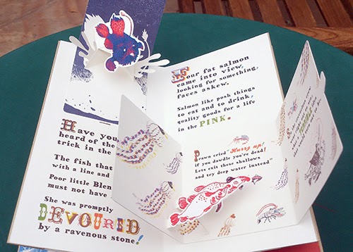
The Golden Plaice was the final project for my masters. It is a handmade pop-up book about an adventurous prawn inspired by nonsense literature and Cornish sealife. The first version I made was illustrated purely with pencil drawings but I gradually began to replace elements with printed imagery.

The Golden Plaice.  Original pencil drawings.

The Golden Plaice.  Red layer.I digitally split each drawing into 3 colour layers (red, blue and black), deleting some parts and filling other areas with black or a halftone pattern.
The Golden Plaice. Page 0. Silkscreen print. 3 colours, not editioned.
The Golden Plaice. Page 0 – Final version.  The final version that I used for the book is made from several versions of the same print – because I was printing the book with an inkjet printer I could change some elements digitally, picking the best characters and type.
As I worked through the pages I began to get to grips with layering colours to create new colours. My bird design inspired by classic tattoos was an exercise in creating new colours from 3 primary layers – yellow, red and blue. I began to apply these working methods to the screen prints for my book.

Birds. 3 colour silkscreen print, edition of 7. This print was an experiment in using layering halftones to create new colours.
The Golden Plaice. 3 colour silkscreen print. Set of four prints.
The Golden Plaice. How I used the screen print in the book.
I printed some of the type for the book, I found by intentionally misregistering some of the typography I could create some interesting effects. To make the book, my screen prints needed to be scanned, resized and printed as high quality inkjet prints. These inkjet prints are then cut out and the book can be assembled. The cover is printed using a technique called gold foil blocking. It takes me about two weeks to print, cut out and assemble each book. Each book is a new edition of one and so far I have made five with another four currently on order.


I am showing the first edition at The Print Shop, with the fifth edition currently being shown in Sheffield as part of the international book prize exhibition.

Forum 2013. Collaboration with Alys Jones. 3 colour silkscreen print, edition of 60.
Forum 2013 no.2 . Collaboration with Alys Jones. 3 colour silkscreen print, edition of 60. The red layer is blurry because the exposure unit had a dodgy vacuum.
This year I was invited back by Falmouth University to work with illustrator Alys Jones on the 2013 Illustration forum poster. I took her beautiful black and white designs and turned them into three colour screen prints (see above images). I was using a very old exposure unit and one of the colour layers became blurry and a lot of detail was lost but it is mistakes like these that I savour now, they are part and parcel with the joy of printing.

Printing new prints for The Print Shop

John Kilburn has created some new prints shown for the first time in The Print Shop. The first features images intended for a new book I am making Hummingbirds – a tragic love affair between a pyromaniac temptress and a romantic madman inspired by a series of terrible analogies. 

(detail)

The next print is based on some paintings of crabs that he made for his last exhibition. John has always been fascinated by sea life and happens to only live two minutes from the beach. 


We're honoured to have John sell his work through our shop for the rest of this Volume (finishing on 3rd Nov).  Don't miss out on seeing this bright new talent and looking through the pop-up book he has supplied us with too.


The Print Shop
Unit 6
Quakers Friars
Cabot Circus
Bristol
BS1 3BU
Open Daily
Mon - Sat 10am - 6pm
Sun 11am - 5pm

Wednesday, 28 August 2013

Guest Artists for Volume 2 at The Print Shop

One, Irena Czapska and Tom Sowden, 2012
Printed Steel, Inkjet-printed and laser cut paper, laser cut Perspex and neon, P.O.A.


The Print Shop is very happy to welcome the work of Spike Print Studio director Irena Czapska and Tom Sowden, Senior Research Fellow in artists’ books and academic lead for the Centre for Fine Print Research's laser cutting area.

The work ‘One’ comprises of layers of printed work and a neon sign. It is the result of the Diptych Project, in which a selection of UWE MA print artists and Spike print artists where randomly put together to create, in collaboration on the theme of a Diptych.

‘One’ is a cutting edge piece of contemporary print which comprises of layers of Imagery made using a range of methods.
One, Irena Czapska and Tom Sowden, 2012
Printed Steel, Inkjet-printed and laser cut paper, laser cut Perspex and neon, P.O.A.


Irena’s trade mark massive screen print onto steel using ink, varnish and fast rusting iron powder sits as the back layer, a massive ambiguous portrait which appears to have evolved on the surface of the steel proving there is so much more to the art of screen printing, In front of this a neon sign draws the word one across the face. Tom Sowden has his touch in the next layers, which show an institutional glass door, the gridded glass in the image is cut with a laser cutter to reveal the huge ambiguous portrait and electric sign. Finally on a transparent piece of acrylic the laser has been used again to create a layer of invisible text, which flows automatically across the work catching the blue neon and mirroring the portrait, which underpins the whole piece.

The piece is a great example of what happens when the word print is taken beyond tradition, Since the arrival of the laser cutter the boundaries between original print and digital print have been blurred and modern tools like the laser have provided printmaking artists an entirely new ways of working and pushing the boundaries of what constitutes the original print.

We are very happy to have this work in the shop and hope you enjoy its many dimensions.

Monday, 8 July 2013

Video Link to Yuji Hiratsuka: Meet the artist on the 15th August.

Check out the link below to find out more about our international guest print-maker Yuji Hiratsuka.

Yuji sent the video over to us to get some background info before our first live international link up event at the print shop.

http://www.opb.org/programs/artbeat/segments/view/933

On the 15th August at 7pm, The Print Shop will host a Skype conversation with Yuji. Please put this very special event in your diaries and pop down to The Print Shop - RSVP here

Thursday, 20 June 2013

Yuji Hiratsuka > International Guest Printmaker


We are extremely happy to announce that The Print Shop will be featuring two prints by the very highly acclaimed Yuji Hiratsuka. The professor of Fine Art at The Oregeon State University has kindly accepted our invitation to become our first international guest printmaker. He has sent us two stunning prints which have never before been to the UK and are truly a must see.

Yuji's work combines traditional Japanese Ukyioe style prints with contemporary western styles and fashions. His two large scale prints will feature in the shop from the 24th July until the 28th August. Whilst they look beautiful on our shiny new blog we assure you they are much more amazing on paper.
Yuji creates his complicated prints using etching methods, embossing and  Cine-colle (the use of collaged paper in printmaking). The etching plates are created using a range of etching methods. Yuji creates all of his colours using only one plate which is recreated continually throughout the process of printing. Using red, yellow, blue and black in combinations to create a wide variety of colour which mix with translucency, The prints are finally embossed with textures and  are stunningly luminous.

Yuji will also be online for a live question & answer session during a very special 'Meet the Printmaker' evening - technology is great! Watch this space for more details of this exciting opportunity to find out more about Yuji's amazing print work from the man himself.

These amazing prints are exhibited all over the world and are now coming to Bristol - we are very excited!

Yuji's prints are created on traditional Japanese handmade paper and The Print Shop will also be hosting a series of workshops exploring this material. Local artist Elaine Cooper, who has spent years living between the Uk and Japan mastering the art of Japanese paper, will be running demos and workshops in the shop. More on this coming soon....