Sunday, 27 October 2013


The Print Shop has a range of workshops on offer this autumn to keep you inspired and creative as the cold weather and long nights draw in.  Refresh your printmaking and craft skills, or learn something new.  We explain some of the print terminology to give you an idea of what's currently on offer.


Etching is an intaglio technique, in which a drawing is created on a sheet of metal (usually copper, zinc or steel) coated with a thin acid resistant layer, with a sharp tool.  The plate is then immersed in a bath of acid which 'bites' or etches away the metal in the areas exposed by the drawing.

Once the design has been etched to a sufficient depth, the acid resistant layer is cleaned off, and ink is rubbed into the lines of the design, before being wiped clean.  A sheet of dampened paper is placed over the plate, which is then fed through a printing press to apply pressure.  This causes the ink to be pulled out of the incised lines and onto the paper, creating the platemark.

Take a look at Gilly Thompson and Liz Bath's Introduction to Etching workshop, taking place on Friday 1 November.

Monoprinting can take many forms, but in basic terms, is a single impression of an image which can only be printed once. It can be made in a number of ways, such as using a metal etching plate, a litho stone, a wooden block, or using paint or collage. 

Sophie Rae, one of our featured printmakers, creates mono prints by sketching, hand cutting paper stencils, and using a roller to mix her vibrant oil-based inks, before applying the inked stencils to her images, and creating lots of depth and layers with graduating tones.

Sophie will be teaching her individual monoprinting technique in her workshop on Wednesday 30 October.  Click here for more details.

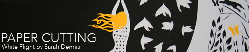
Paper cutting is the art of cutting paper designs (using scalpels and other cutting tools), but can be broadly applied to a number of different applications and styles.  It has evolved uniquely all over the world to adapt to different cultures.

Sarah Dennis, who has joined Volume 3 of The Print Shop to teach others the way of her craft, creates designs inspired by Chinese paper cutting, nature and her childhood.  Her work combines traditional collage with contemporary techniques to create a bold unique and stylised imagery that's bursting with charm.

You can find out more details about her workshop on Thursday 31 October by clicking here.


Meet the printmaker: Katharina Nyilas


Please can you introduce yourself and tell us a little about your work? What sort of prints do you make?

I have been living and working as an illustrator in Bristol for one year since graduating from University of Westminster, with an honours degree in Illustration.

Nature, wildlife and our environment inspires most of my work, which I believe is of vital importance.  My illustrative work is intricate detailed and delicate, which is why I love to explore with screen printing, which by the nature of the process creates much stronger bolder shapes and lines, allowing my work to make a different impact.


Are you solely a printmaker, or do you work in any other creative fields?

I also work in the field of illustration, and as a creative workshop coordinator.

What is your earliest recollection of making a print and what made you to want to do more?

My earliest recollection of printmaking was at the age of 16 at Somerset College of Art and Technology.  The printmaking tutor, Chris Tucker, chose me from a group of students studying fine art to produce an etching.  It was a long process, as most printmaking processes are, and took a lot of time, attention to detail and methodical precision.  The process suited my work as, with etching, very fine lines and details can be produced.  I enjoyed being absorbed by the process and the excitement of seeing the outcome of the first print.  I still enjoy this aspect of the print-making process including the opportunity to experiment.


What inspires you? Are there any themes or ideas that often run through your work? 

The influence and control people have over our environment intrigues me and I like to research different aspects of this, whether it happens to be regarding fishing policies, our urban wildlife, pollution or poaching.

I am also interested in re-using and recycling materials, and have been experimenting with utilising them in my printmaking.  I have used found wood, fabrics and ripped sheets of billboard, which I have found hanging billowing in the wind and littering the ground.


Could you give us an insight into where you work (your studio/workspace and where you print)? 

Over the last year I have been creating illustrations from my desk at home. Since joining the Drawn in Bristol illustration collective over the summer, I have been hot-desking and screen-printing in the studio at Hamilton House.  I am now looking forward to joining the Drawn in Bristol studio at the beginning of November.


Printmaking is made up of lots of different processes. Which aspect of printmaking do you enjoy the most?

I mostly enjoy planning and drawing the print, experimenting with materials and the excitement of seeing the outcome!


Do you have a favourite tool or something you find invaluable when printing?


Being organised and clear from the start with the result you are trying to achieve is very important.  Creating a good print involves a lot of planning and work before the print can actually be made.  For example, pulling a screen-print is the fastest part of production after the methodical process of preparing.


How would you like to develop your printmaking skills in the future?

At the moment I am experimenting with screen-printing, and using different found materials to work with.  I would like to carry on experimenting with screen-printing for the time being, as it is such as versatile technique. Almost anything can be printed onto, which suits me, as I enjoy making my own illustrated products.  In the future, I may take up a printmaking course and learn other processes.  The variety and versatility of the other printmakers' work at The Print Shop has definitely intrigued me and inspired me to learn more!


Which printed publication do you most look forward to thumbing through?

Wrap magazine is one publication I love to look at, for the variety of colourful work.  I like the fact that it gives artists and printmakers a slightly different platform to showcase their work, in contrast to other illustrated publications.  The artwork is showcased on its own in a large format.  The best thing about it is that it also doubles up as wrapping paper.  Although, I always think the work is too beautiful to use as wrapping paper and could be used to decorate your walls instead!

And finally, monochrome or multi-coloured?

Although some of my prints are in monochrome, most of my prints utilise colour.  Mostly I tend to use monochrome alongside colour.

Thank you for giving us some insight into the environmental inspirations behind your beautiful work, Katharina!

Katharina's work will be appearing in The Print Shop for the rest of Volume 3, ending on 3 November.  Come and experience Kati's work for yourself at our shop in Quakers Friars!


The Print Shop
Unit 6
Quakers Friars
Cabot Circus
Bristol
BS1 3BU
Open Daily
Mon - Sat 10am - 6pm
Sun 11am - 5pm

Saturday, 26 October 2013

Meet the printmaker: Pirrip Press


Please can you introduce yourself and tell us a little about your work...
What sort of prints do you make?


Pirrip press was conceived by Georgie and myself last year. It is the joint culmination of our various creative enterprises. We work for clients on design, illustration and print work, with a particular focus on bespoke, hand printed stationery. We also design and produce work for ourselves, illustrations, posters, notebooks and other printed items, that we sell at markets, online and with a few independent retailers. We also illustrate, write, and self publish our own books. We try to produce one new publication a year, in limited editions of under 100 copies.
Our work is quite diverse, but we like colours, shapes, layers and words
and produce mainly silkscreen printed work, often limiting ourselves to
two or three colours.


Are you solely a printmaker or do you work in other fields?

We both love printing, but yes, we also work in other fields. Georgie teaches on illustration courses at Cheltenham and Cardiff and also lectures on the MA
in Illustration at Falmouth University. I do bits and pieces of design work and illustration as a freelancer and like drawing, but spend most of my time doing Pirrip Press work.


What is your earliest recollection of making a print and what made you want to do more?

I think it was a butterfly print. At my Grandma and Granddad’s dining room
table. Where you make one half of the butterfly with Paint and then fold the
paper in half to squash (print!) the same pattern on the other side to make the
two identical wings of the butterfly. Not sure what print method that is!
They were brilliant and smudgy and bold though.
We were discussing print recently and both realised that one of our favourite
things is seeing lots of things all the same, all lined up.
Obviously printing an edition and seeing it drying on the rack is therefore
massively satisfying for us!

 
What inspires you and are there any themes or ideas that often run through your work?

We are both storytellers, and know that things are nearly always better if
there's a story behind them, so we do plenty of research. We're also both quite keen on science and nature, there are lots of youngster's science books in our studio. They are a really good source of inspiration, and as the information they impart is usually in bite sized bits for children, they're easy for our non-scientific minds to comprehend!


Could you Give us an insight into where you work, your studio or workplace and
where you print?


We have a small studio at home, more of an office really.
This is where we do our design work and all the prep for our prints.
It's pretty full, big plan chest and two desks, and there are a few inspirational
prints hanging on the walls.
We have a whole run (20ish) of time life books with their different coloured
spines all lined up in rainbow order.
We print at spike island, where we are key holders. It's a brilliant studio and
we really enjoy working there. Everyone is friendly and helpful, and it's really
nice to chat to people about their work and what everyone is up to.


The work of which other printmakers do you admire?
We have a Sister Arrow print which is lovely and bright and hopeful, and we also have a big Johnny Hannah screen print waiting to be framed.
We like lots of old printmakers, both of us are Ravilious fans. And I really like the lithographs that Rosemary and Clifford Ellis made in the 50s onwards, mainly commercial work for transport for London and book covers for the new nature series, but it's really vibrant and beautiful.


Printmaking is made up of lots of different processes, which aspect do you enjoy
the most?


The layering. Constructing the image in your mind and in black and white
and then the magic when you layer the colours and the new colours come
through in the overlaps.


Do you have a favourite tool or something you find invaluable when printing?
We have a good small wooden handled squeegee which is pretty old but a
firm favourite because it's light.


Can you share a little printing trick or secret with us?
Not sure it's a secret but the multiply filter in Photoshop / illustrator is
invaluable for checking what colours the different opacities of ink might
produce when it comes to print. And we like to twist our pile of paper before we start printing so it's easier to pick up the single sheets.


How would you like to develop your printmaking skills in the future?
We are always striving to print the best prints we can so we will always be
looking for better methods and tricks! I think we would both like to do a little
more unplanned printing, some experiments where we don't have a fixed
outcome in mind, as we really enjoy the playful printing when we do it,
and like the look of the test sheets where three jobs worth of random printing
is all layered up on top of one another.


Which printed publication do you most look forward to thumbing through?
The gentlewoman.


Monochrome or multi-coloured?

Variety is the spice of life.
 

Thank you for sharing your working process and inspirations, Alex and Georgie!

Pirrip Press will be at The Print Shop for the rest of Volume 3. 


The Print Shop
Unit 6
Quakers Friars
Cabot Circus
Bristol
BS1 3BU

Open Daily
Mon - Sat 10am - 6pm
Sun 11am - 5pm


Friday, 25 October 2013

Meet the printmaker: Jill Spence


We re-visit Jill Spence, who's back to join The Print Shop's Volume 3 team!

Please can you introduce yourself and tell us a little about your work?  What sort of prints do you make?

Hello, my name is Jill and I’m a silk screen printer.  I hand print in small quantities large and small scale prints, greetings cards and gift items such as cotton bags.  My prints have a graphic, stylised feel.


Are you solely a printmaker, or do you work in any other creative fields?

I’m a Graphic Designer by trade, and having recently been made redundant, I thought it would be an exciting opportunity to develop and follow my passion for screen printing.


What is your earliest recollection of making a print and what made you to want to do more?

At primary school where we had to cut out a paper stencil and put it on a screen to print with. I thought it was like magic when the picture emerged!

What inspires you?  Are there any themes or ideas that often run through your work?

I’m inspired by the Moorish art found in Andalucia, Spain, from a visit there a couple of years ago., I love shapes and patterns which are stylised, symmetrical as well as repeat patterns.

Moorish art and patterns inspire Jill's graphic designs

Could you give us an insight into where you work; your studio/workspace and where you print?

I have a fantastic studio space in Hamilton House in Stokes Croft. There is an eclectic mix of artists, from painters, illustrators, and milliners to puppeteers, so it’s a very creatively indulgent place to work.

Jill's workspace in the eclectic Hamilton House in Stokes Croft

Which other printmakers' work do you admire?

I really like the work of Sanna Annuka, a screenprinter and designer from Finland. I like her stylised animal forms and colours.

By Jill Spence

Printmaking is made up of lots of different processes. Which aspect of printmaking do you enjoy the most?

I enjoy the first pass of my design, as you never quite know how the print is going to look. It always looks a little different hand printed than it does on a computer screen.


Do you have a favourite tool or something you find invaluable when printing?

An old rag! I'm a messy printer, and a dot of paint on my hand can mean a write-off, so I always have a cloth rag to hand to wipe off any paint..

Can you share a little printing trick or secret with us?

Make sure the consistancy of your ink is 50% acrylic and 50% mixing medium. If it's too thick, the paint will dry quickly. Also, if you have to leave your printing, wet a tea towel, wring it out and gently lay it over your screen to prevent the ink from drying out.


How would you like to develop your printmaking skills in the future?

I’m relatively new to screen printing, and see my style evolving at the same time as developing my printmaking skills. I’d like to use different textures and colour overlays to achieve a variety of effects. I want to experiment and see what I can achieve and how far I can push my printmaking skills.

Monochrome or multi-coloured?

Multi-coloured at the moment, although I plan to develop a range on monochrome Christmas cards.

Thank you, Jill!  We can't wait to see your monochrome Christmas cards in the shop, and look forward to seeing how your print work evolves!

Jill will be at The Print Shop for the rest of Volume 3, with all of the above work for sale (while stocks last!). 


The Print Shop
Unit 6
Quakers Friars
Cabot Circus
Bristol
BS1 3BU

Open Daily
Mon - Sat 10am - 6pm
Sun 11am - 5pm

Wednesday, 23 October 2013

Meet the Printmaker - Anna Harley


The latest of our artist interviews... we were delighted to catch up with Anna Harley. Amongst other things, Anna gives us an insight into her ancestry, influences and love of print...

Please can you introduce yourself and tell us a little about your work…What sort of prints do you make?
I completed a Masters Degree in Printmaking at UWE about five years ago and have been building up a body of work ever since, predominantly screenprints. While the work I make is rooted within the Landscape tradition, the fabric textures in my prints are an echo of my Scandinavian Arts and Crafts background and nomadic childhood. I now live with my family at the foothills of the Mendips, just South of Bristol and divide my time between my studio at home and Spike Print Studio in Bristol. I sell my work through galleries in London, Cardiff and Bristol and also have recently exhibited in London at The Royal Academy Summer Exhibition, Bite: Artists making Prints and Battersea Affordable Arts Fair.

Catkins ( 76cm x 56cm)

Are you solely a printmaker or do you work in any other creative fields?
I now almost exclusively produce screenprints, though I have done a lot of painting in the past, mainly in oils and acrylic. I make a lot of things for my home – ranging from home made curtains and upholstery to the hand printed ceramic tiles that line my shower room! Working as a part time mathematics teacher ensures that there is a regular pay-check coming in and both mathematics and teaching are very creative processes.

What is your earliest recollection of making a print and what made you to want to do more?
I owe my preference for print to my Swedish lineage – my Great grandfather’s sister, Maja Fjaestad, was a well known artist in Southern Sweden. Maja’s paintings and prints decorated the walls of the houses of my relatives and I now even have a few of my own. I grew up surrounded by her work and that of the other Rackstad Artists; equivalent to the Bloomsbury group in England of the same time. The Rackstad colony and grounds, near Lake Racken in Sweden, are now preserved as a museum and art gallery. During an HNC course, I began to make very large scale (150cm x 100cm) woodcut prints. As a result of the large amount of cutting away necessary, I developed trigger finger, a RSI, and looked for another less damaging and quicker print method to use. Screenprint proved to be a flexible alternative print medium that had the added benefit of enabling me to incorporate digital imagery in my work. In a hangover from the relief print production, I still often create stencil cut outs from black card for screenprint exposure and use wood like textures as background to the silhouette imagery: I like the feel of a hand cut line and wood grain effect of chiffon moiré.

Mini Print - Gold Leaf 

What inspires you and are there any themes or ideas that often run through your work? Inspirations for my work include; how it feels to be outside, tree silhouettes, passing seasons, the sky and how it changes from sunrise to evening, the weather..... Like a Jackdaw, I love things that sparkle and twinkle. I often use metallic pigments and, in a move that fully embraced my inner kitsch, I have recently made a snow print using white glitter.

Could you give us an insight into how and where you work?
I constantly collect material and ideas for new prints while gardening, or out walking in the countryside around where I live, in the foothills of the Mendips. I am lucky to have a North facing studio set up at home, where I draw and prepare artwork for printing. Once everything is ready, I make my screenprints at Spike Print Studio, in Bristol, where I have been a member for the last five years. Thanks to Spike Print Studio’s 24 hour access, I have been known to print through the night!...but the best time of day for me is early in the morning. I have a routine – apron on means it is time to work.

Mini Print - Sunrise

Printmaking is made up of lots of different processes, which aspect do you enjoy the most?
The screenprinting process suits my practice, because it allows me to build images in fine layers of ink, printing layer upon layer until I am happy with the final print. I use a combination of drawing, digital photography and objects directly exposed on the screen, to create these individual layers. I enjoy the tension this creates in my images – is the print based on a drawing or photograph? Is it attached to fabric, pencil marks or ink? While engaged in the creative process, I try to stay open minded about how the finished print will look, to allow the print to make itself – print is an extremely process led way of making art and allowing the unexpected to happen and taking advantage of these happy accidents allows the work to stay fresh and exciting. I love the drama of proofing a print; when suddenly everything comes together with the final layer of ink – and the print starts to sing. Once I am happy with the initial artists proof, I will then screenprint an additional number of limited edition prints, each matched against the artist proof, which I sign and edition (1/25, 2/25 etc). Because prints are produced in multiples, high quality prints are much more affordable than other forms of original art. I believe that original art belongs in people’s homes every bit as much as it belongs in public galleries and communal spaces, and with this in mind, I have recently made a series of mini-prints - small landscapes printed in editions of 80, with intention of making artwork that is affordable for all. These will be on sale in the shop during July and August.

Do you have a favorite tool or something you find invaluable when printing?
For the last few years I have almost exclusively printed up to the deckle edge of the paper – I think this is a more contemporary approach to print. Historically a paper margin of around six inches was left around the edge of the print and used to attach the print behind a mount ready to frame - all my work is now ‘float mounted’ so the print appears to float in its frame – celebrating, rather than hiding the print and the paper. The longer I spend as a screen-printer, the fussier I become about my materials. Where I was once perfectly happy with standard acrylic printing inks, I am now only really happy with the expensive higher quality pigment inks available from Lascaux..... I am also a real paper nerd – and love the quality of specialist, acid free, 100% cotton papers like the French artisan made, ‘Arches 88’ – expensive to buy, but worth every penny because of the print quality and archival features.

Starry Night

Can you share a little printing trick or secret with us?
Don’t work in isolation - Community is really important. The best thing I ever did was to become a member of Spike Print Studio, this gave me a base to work from and a readymade artistic community of fellow print makers, to spur me on, bounce new ideas around and help with advice and guidance when I come up against problems.

How would you like to develop your printmaking skills in the future?
Where to start? I make sure I enroll on at least one new course a year and I spend time each week talking to other members at Spike Print Studio about what they are making, in order to keep my work fresh and continually evolving. If I could introduce a few more days to each week, I would experiment across more print mediums. In the near future, I would like to mix embossing, laser and chine collé with screenprint. Anything that involves breaking a few rules – in spite of my Scandinavian upbringing, I am secretly quite subversive…

Which printed publication do you most look forward to thumbing through?
Anything by Deborah Wye

Monochrome or multi-coloured?
Both

A selection of six mini prints, all screen printed
Clockwise from top left: Gold Leaf, Autumn Beech, Sunrise, Starry Night, Sunset, Moon Fruit

Thanks Anna for sharing so much with us, your prints are truly beautiful!

Anna Harley is one of the many talented printmakers contributing to Volume 3 of The Print
Shop, October 2nd - November 3rd... Why not come along and have a look for yourself!


The Print Shop
Unit 6
Quakers Friars
Cabot Circus
Bristol
BS1 3BU

Open Daily
Mon - Sat 10am - 6pm
Sun 11am - 5pm


Tuesday, 22 October 2013

Guest Printmaker: John Kilburn

Currently, on our featured Guest Artist wall, we have a selection of wonderfully imaginative prints by John Kilburn. Originally from Bristol, John grew up in Devon, then moved to Bath where he studied graphic design and illustration at Bath Spa University. He is now a freelance artist, illustrator and designer based in Falmouth, Cornwall, having recently completed an MA in authorial illustration at Falmouth University. He loves making illustrated books, drawing and silkscreen printing, with inspirations from natural history and the absurd. 

We caught up with him to find out a bit more about his beautiful and sought after print-work.

My earliest memories of printmaking are probably similar to most peoples – potatoes and bubbles! Since then I have tried most forms of printing but it is only in the last 3 years that I have begun to use silkscreen as an integral process for my work. I did a short screen-printing workshop in Bath before I moved to Cornwall to start my MA.

During my masters I concentrated on three things - research, drawing and printmaking. I began to research into humour and the absurd; why do we find things funny? My first project was a visual response to trashy movies including vintage grind-house and B-movies as well as modern black comedies. I was intrigued by the intentional use of violence and obscenity for humorous purposes.

I tried to find processes and effects in screen-printing which were analogous to the qualities of cheap, trashy movies, using very cheap paper such as sugar paper and newsprint which would bleed, wrinkle and tear.  I also used low-res images for making the acetates and would intentionally misregister the layers. I began making screen-prints from original pencil drawings which naturally lose a lot of fine detail during the printing process. Being a complete amateur at this stage I was effectively trying to print badly whilst making a lot of unintentional mistakes at the same time!

Metamorphosis. 2 colour screen print in an edition of 120.
Around this time I was asked to make the poster for Falmouth University’s prestigious illustration forum. The theme was metamorphosis which happens to be a common theme in a lot of trashy cinema. My design was inspired by vintage film posters. This was the first time I had attempted a large print run and many more mistakes were made.

Cock ‘n’ Bull yellow. 5 colour print, edition of 30.
The following year I was asked to make the posters for the 10th anniversary forum The Absurd Event. I made two designs based on metaphor and the absurd. The absurd bird was printed in three colours as an edition of 80. Cock ‘n’ Bull was printed in five colours in a yellow edition of 30 and a blue edition of 10.

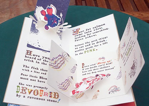
The Golden Plaice was the final project for my masters. It is a handmade pop-up book about an adventurous prawn inspired by nonsense literature and Cornish sealife. The first version I made was illustrated purely with pencil drawings but I gradually began to replace elements with printed imagery.

The Golden Plaice.  Original pencil drawings.

The Golden Plaice.  Red layer.I digitally split each drawing into 3 colour layers (red, blue and black), deleting some parts and filling other areas with black or a halftone pattern.
The Golden Plaice. Page 0. Silkscreen print. 3 colours, not editioned.
The Golden Plaice. Page 0 – Final version.  The final version that I used for the book is made from several versions of the same print – because I was printing the book with an inkjet printer I could change some elements digitally, picking the best characters and type.
As I worked through the pages I began to get to grips with layering colours to create new colours. My bird design inspired by classic tattoos was an exercise in creating new colours from 3 primary layers – yellow, red and blue. I began to apply these working methods to the screen prints for my book.

Birds. 3 colour silkscreen print, edition of 7. This print was an experiment in using layering halftones to create new colours.
The Golden Plaice. 3 colour silkscreen print. Set of four prints.
The Golden Plaice. How I used the screen print in the book.
I printed some of the type for the book, I found by intentionally misregistering some of the typography I could create some interesting effects. To make the book, my screen prints needed to be scanned, resized and printed as high quality inkjet prints. These inkjet prints are then cut out and the book can be assembled. The cover is printed using a technique called gold foil blocking. It takes me about two weeks to print, cut out and assemble each book. Each book is a new edition of one and so far I have made five with another four currently on order.


I am showing the first edition at The Print Shop, with the fifth edition currently being shown in Sheffield as part of the international book prize exhibition.

Forum 2013. Collaboration with Alys Jones. 3 colour silkscreen print, edition of 60.
Forum 2013 no.2 . Collaboration with Alys Jones. 3 colour silkscreen print, edition of 60. The red layer is blurry because the exposure unit had a dodgy vacuum.
This year I was invited back by Falmouth University to work with illustrator Alys Jones on the 2013 Illustration forum poster. I took her beautiful black and white designs and turned them into three colour screen prints (see above images). I was using a very old exposure unit and one of the colour layers became blurry and a lot of detail was lost but it is mistakes like these that I savour now, they are part and parcel with the joy of printing.

Printing new prints for The Print Shop

John Kilburn has created some new prints shown for the first time in The Print Shop. The first features images intended for a new book I am making Hummingbirds – a tragic love affair between a pyromaniac temptress and a romantic madman inspired by a series of terrible analogies. 

(detail)

The next print is based on some paintings of crabs that he made for his last exhibition. John has always been fascinated by sea life and happens to only live two minutes from the beach. 


We're honoured to have John sell his work through our shop for the rest of this Volume (finishing on 3rd Nov).  Don't miss out on seeing this bright new talent and looking through the pop-up book he has supplied us with too.


The Print Shop
Unit 6
Quakers Friars
Cabot Circus
Bristol
BS1 3BU
Open Daily
Mon - Sat 10am - 6pm
Sun 11am - 5pm